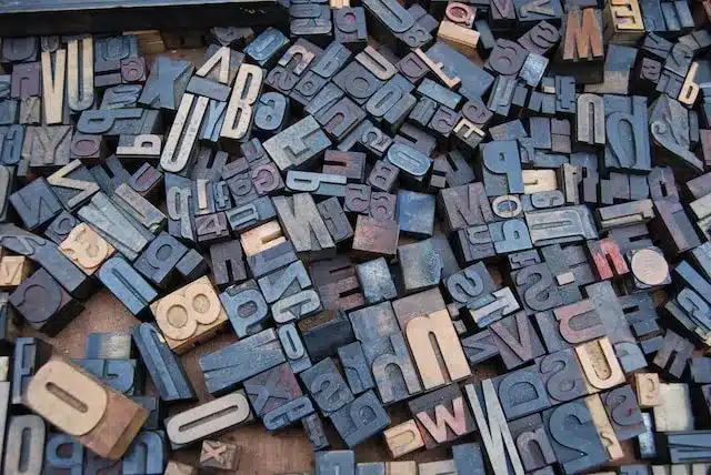
What are the Most Readable Sans Serif Fonts?

When it comes to design, website and graphic designers have several things to consider. For an outsider, the look and feel may be about the imagery and placement of elements. However, professionals understand the significance of choosing the best fonts and typography.
They determine the readability, legibility, and quality of the web asset. Moreover, studies suggest that different fonts can affect the reader’s experience in many ways, from their learning to memory. Creative Market notes that the right font can effortlessly elevate a website and marketing materials.
Choosing the right typeface might seem a simple task that hardly requires a second thought. However, the best designers spend a considerable time selecting it because they match the font style with the industry, target audience, and device requirements for the design project. Readability is another key factor.
Before digging deep into the best options in this context, you should understand the concept of readability in typography.
What Makes a Font Style Easy to Read?
Several factors determine how easy a font is to read on computer screens and mobile devices. These include the size, colors, and spacing between letters. The x-height, the distance between the text baseline and the tops of lower-case letters, determines whether they appear open or cramped.
Likewise, readability also depends on whether the font is utilitarian or decorative. Sans-serif fonts like Arial, Calibri, Helvetica, Open Sans, and Roboto score better than their serif counterparts, such as Times New Roman and Georgia, because of their simplicity and minimalism.
Exploring the Most Readable Sans Serif Fonts
Sans serif typefaces are a popular font choice because of their simplicity, readability, and versatility. They are even easy to read on low-resolution screens. As you settle for this option, you need to understand that it has several subtypes with different features. When choosing between them, readability should be a priority.
Here is a list of the most readable fonts in the San’s serif typeface family:
Open Sans
Open Sans font is clean, simple, and professional, yet it never falls short on the creative front. It looks great in small and large sizes, making it a versatile option. Since the letters feature more spacing, this style gets extra points for legibility. When it comes to readability, Open Sans is ideal for both digital assets and print publications.
Helvetica
Helvetica is one of the easiest fonts when it comes to readability. Its classic design with decades-old roots is another reason for its popularity. The style features tall and thin letters with tight spacing. The best part is that it is legible in large or small sizes, both up close and at a distance. Despite its simplicity, Helvetica makes a great choice for professional web design.
Arial
Arial is a contemporary sans-serif font acclaimed for its legibility, natural strokes, and open design. It is more humanistic compared to its predecessors, with softer and fuller curves that most industrial style sans serifs lack. With this easy-to-read font, you get the best of aesthetics and eye comfort. You may see Arial more in print use, but its openness makes it an ideal choice for web designs.
Montserrat
Montserrat is a relatively new release, but this geometric sans-serif typeface has gained popularity because of its legibility. The font style was created using signs but gradually found a place in web pages. It is apt for long blocks of text, such as the body text of a website. The best thing about this easy-to-read font is that it minimizes eye strain.
Futura
Although the Futura font dates back to 1927, it is a timeless style with a futuristic appeal. The font features a geometric design with clean, thin character strokes that look great on screens. Besides being easy to read, this font is suitable in casual and formal contexts.
Tisa
Tisa is a versatile and super-legible font style, making it a hot favorite for web and graphic designers. The discerning features of this font include a wider-than-usual kerning (space between letters) and a large x-height. These features enhance its readability in all the smallest sizes, headings, and different contexts.
Roboto
Next on the list is Roboto, a Google font designed for the Android mobile operating system. While created for Android smartphones, the font is now used as the default for Chrome browsers, thanks to its good readability and visual appeal. The style is elegant yet understated, making it a favorite for graphic designers with a discerning eye for the best.
Lato
Like Roboto, Lato is one of the popular Google fonts tailor-mades for the web. The rounded lettering looks casual and professional at the same time, making it apt for diverse use cases. The good readability of Lato is attributed to its distinct yet unobtrusive typesetting style.
Tahoma
Tahoma is a new sans-serif typeface created by Microsoft. It comprises regular and bold Windows TrueType fonts, making it a versatile option for type designers. The font addresses the readability challenges of on-screen display at small sizes in menus and dialog boxes.
Besides these easy-to-read fonts for the web, Garamond deserves a mention as a good print font. While it is great for books, you may pass it for websites because of its relatively small height.
Conclusion
Undoubtedly, sans-serif fonts score higher than their serif counterparts when it comes to readability. But several serif fonts also read well. Times New Roman and Verdana are popular instances of easy-to-read fonts from the serif family. The next time you choose letterforms for your web assets, remember to go through this checklist.